
The Psychology of Color: How to Use Color Theory in Design to Influence Emotions
Karan kumar
2/9/20245 min read
Introduction
Color is a powerful tool in design, capable of evoking emotions, influencing moods, and creating meaningful connections. Whether you're an interior designer, graphic designer, web designer, or fashion designer, understanding color psychology and its application in design is essential for creating impactful and emotionally resonant spaces. In this blog post, we will explore the psychology of color and how you can use color theory to influence emotions in your design projects.
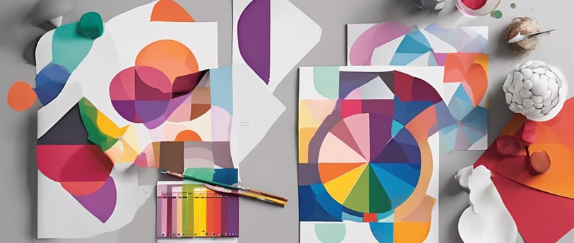
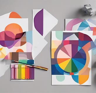
II. The Basics of Color Theory
Before diving into the psychology of color, it's important to grasp the basics of color theory. Primary colors, such as red, blue, and yellow, are the building blocks of all other colors. Secondary colors, such as orange, green, and purple, are created by mixing two primary colors. Tertiary colors are the result of mixing primary and secondary colors.
In addition to understanding primary and secondary colors, it's crucial to recognize the distinction between warm colors and cool colors. Warm colors like red, orange, and yellow, are associated with energy, passion, and vibrancy. Cool colors like blue, green, and purple, evoke calmness, tranquility, and stability.
To further explore the world of color, let's introduce the concept of hue, saturation, and value. Hue refers to the specific color, such as red or blue. Saturation refers to the intensity or purity of a color, ranging from vibrant to muted. Value refers to the lightness or darkness of a color. Understanding these aspects of color will play a vital role in leveraging color psychology in your designs.
III. Emotional Responses to Different Colors
Now that we have a strong foundation in color theory, let's delve into the emotional responses associated with different colors:
A. Red: Red is often associated with passion, energy, and excitement. It can bring warmth and intensity to a design, making it an ideal choice for attracting attention or stimulating appetite in a restaurant.
B. Blue: Blue signifies calmness, trust, and stability. It has a soothing effect on the mind and is commonly used in healthcare or financial institutions to instill a sense of trust and reliability.
C. Yellow: Yellow is a cheerful color that evokes feelings of happiness, optimism, and warmth. It can be used to create a welcoming and lively atmosphere in spaces like kitchens or children's play areas.
D. Green: Green represents harmony, nature, and growth. It is often associated with feelings of relaxation and balance, making it suitable for spaces like meditation rooms or offices where productivity is encouraged.
E. Purple: Purple is a color of royalty, creativity, and luxury. It can add a touch of elegance and sophistication to designs, making it a popular choice in branding for high-end products.
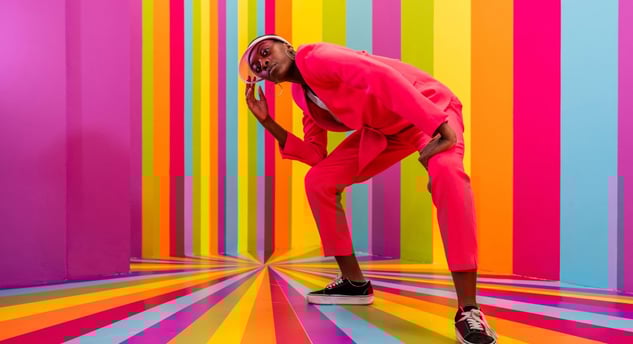
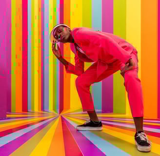
F. Orange: Orange is a vibrant color that symbolizes enthusiasm, vitality, and creativity. It can be used to inject energy and excitement into designs, making it great for promoting events or products.
G. Pink: Pink is commonly associated with romance, nurturing, and sensitivity. It is often used in branding or design targeted towards women or to create a sense of gentleness and softness.
H. Black: Black represents sophistication, mystery, and authority. It is a classic choice for luxury brands and can add a touch of elegance to any design.
I. White: White symbolizes purity, cleanliness, and simplicity. It is often used to create a minimalist and modern aesthetic or to make other colors stand out.
IV. Application of Color Psychology in Design
Now that we have explored the emotional responses associated with different colors, let's examine how color psychology can be applied in various design fields:
A. Interior design: When choosing colors for different rooms, consider the emotions you want to evoke. Use warm colors, like red or orange, in spaces where you want to create a lively and energetic atmosphere, such as the living room or restaurant. For bedrooms, opt for cool colors, like blue or green, to promote calmness and relaxation.
B. Graphic design: Use color psychology to evoke specific responses in branding and marketing materials. For example, if you want to convey a sense of trust and reliability, incorporate blue into your brand's logo and visual identity. If you want to project creativity and vibrancy, consider using orange or yellow in your designs.
C. Web design: Optimize website color schemes to enhance user experience and engagement. Experiment with different color combinations to find the right balance between aesthetics and functionality. For example, use contrasting colors for important call-to-action buttons to draw attention and promote user interaction.
D. Fashion design: Incorporate color psychology into clothing choices to convey certain messages or moods. For instance, a vibrant red dress can make the wearer feel bold and confident, while a neutral-toned outfit can give off an air of sophistication.
V. Case Studies
To further illustrate the impact of color psychology in design, let's explore a few case studies:
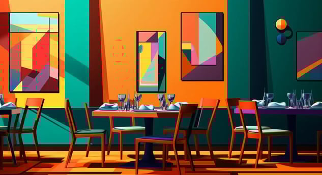
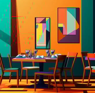
A. Example 1: A restaurant design successfully uses color psychology to create an inviting and energetic atmosphere. By incorporating warm colors like red and orange in their interior decor, they stimulate appetite and create a lively dining experience.
B. Example 2: An impactful branding strategy leverages color psychology to evoke specific emotions. A financial institution strategically uses the color blue in their logo and marketing materials to instills a sense of trust and reliability in their target audience.
C. Example 3: An effective application of color psychology in website design enhances user experience and engagement. By carefully selecting color schemes that complement each other and align with the website's purpose, a web designer creates a visually appealing and user-friendly platform.
VI. Practical Tips for Implementing Color Psychology in Design
To effectively apply color psychology in your design projects, consider these practical tips:
A. Consider the target audience and desired emotions when choosing colors.
B. Use color combinations strategically to create balance and harmony. Experiment with different shades and tones to achieve the desired effect.
C. Test designs and gather feedback to assess emotional resonance. Make adjustments based on user responses and preferences.
VII. Conclusion
Understanding the psychology of color and its application in design is crucial for creating impactful spaces and engaging with users or viewers. By leveraging color theory and considering emotional responses to different colors, you can create designs that resonate with your target audience on a deeper level. So, the next time you embark on a design project, remember the power of color to evoke emotions and make meaningful connections.
Call to action: Apply color theory principles in your own design projects and experience the difference it can make in creating emotionally resonant designs.
Incorporating color psychology in your design toolkit will unlock new possibilities and empower you to create visually stunning and emotionally captivating designs. Embrace the psychology of color and nurture your creative journey.


Contacts
Socials
Subscribe to our newsletter
+91 9508935878
Address - Laxamana nagar Sitamarhi Bihar INDIA 843302.
LEGAL ENTITY:- KK ENTERPRISES .COPYRIGHT 2024 ALL RIGHT RESERVED.
